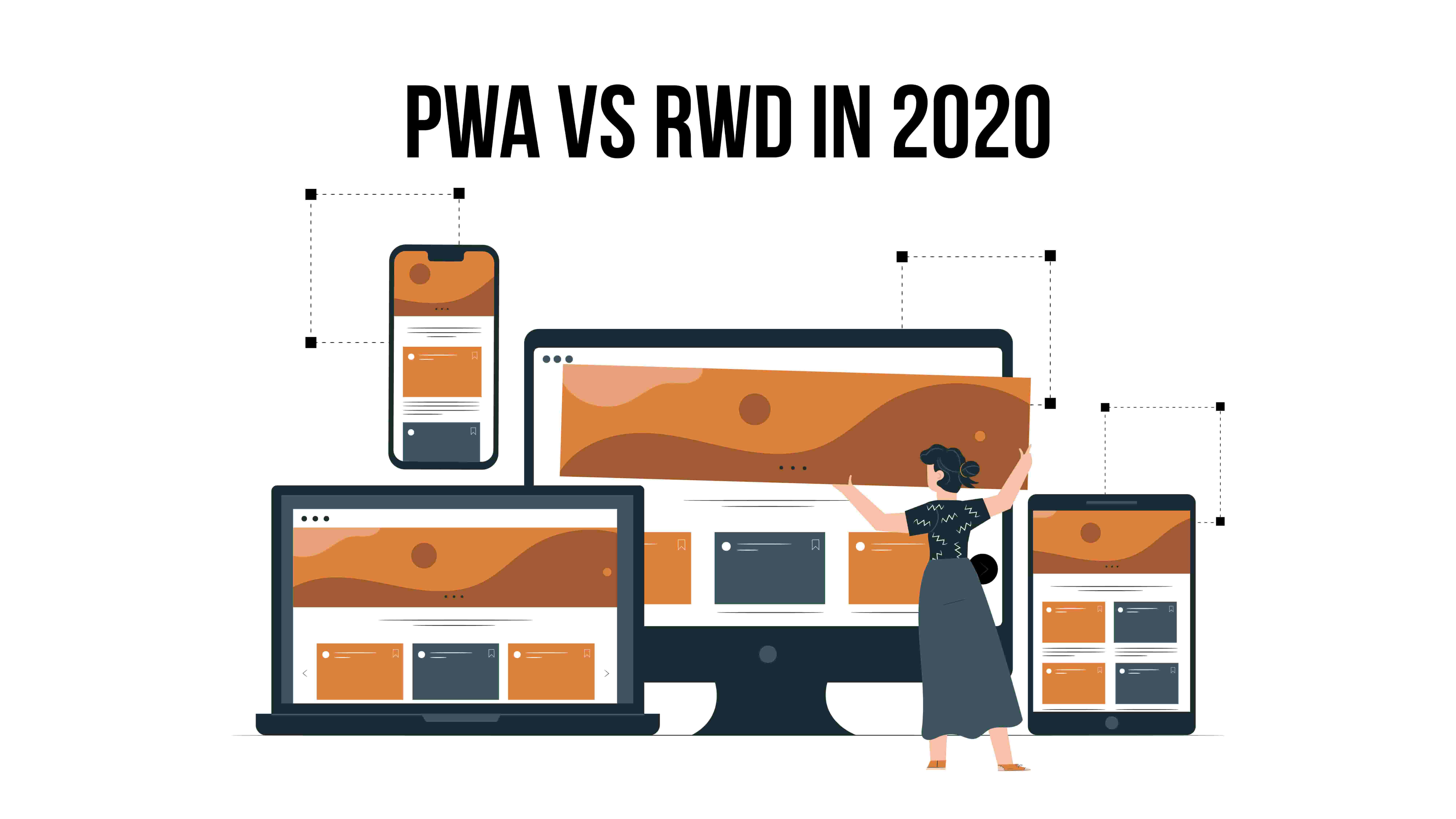
Today, “The User” is in the first place, so, every creator of the app should think about all devices’ user-friendliness. To stay popular, you should listen to the needs and requirements of your app users and care about them🙌.
More than 50% of users choose smartphones for Internet searches. So, according to users’ preferences, Google gave the priority to mobile usability of the websites. As one of the biggest players in the app arena, Google plays a huge role in the modern trend in app development, so, thanks to it, PWAs have become popular.

Responsive Web Design (RWD)
The basic premise of RWD is to design a website that will display correctly regardless of the browser window size. Therefore, universality, which is the biggest advantage of the RWD design technique, has also become its disadvantage.
By creating a page that complies with this methodology, we care about producing a website that displays properly on any type of device. Then we place less emphasis on adjusting some of its elements specifically to the size of the browser window.
After entering the mobile-first index (in Search Google Console) Google will use the mobile version of the content for indexing and ranking. Until now, in the index, when assessing the relevance of a page in terms of a given query, the desktop version was taken into account.
Therefore, it is recommended to design responsive websites available at one URL for mobile and desktop version of the site. Due to some problems and misunderstandings we see it from different cell phone URLs over the years, from both search engines and users.
So, to meet all the requirements of users, we should find the best solution for business and target audience at the same time. PWA and RWD are your solutions. (spoiler: they work together)
Just a quick reminder for you, what PWA and RWD both mean:
Progressive web app (PWA) is a combination of web pages and a native app.
The user doesn’t install it from the app store and usually gets implemented push-notifications. Moreover, PWA can be used on different devices, cause they run on the code, which is similar for all the OS and kinds of devices. It is a solution that allows using a website or web application even without access to the network. PWA is based on Javascript, and it’s much more difficult to optimize it for SEO.
👉A really interesting type of app, isn’t it? If you want to know, Why PWAs are the future of web apps, read our previous post👈.
👉Or, if you are new in topic of PWA, tou can read “What is PWA?”.👈
Responsive Web Design (RWD) is a way of designing websites that the user experience remains at the highest level regardless of the device it is using.
RWD improves user-usability. Responsive websites are designed to have the best impact on SEO, this technology strongly favors SEO. RWD ensures, that your website will look right on any device: mobile phone, laptop or tablet. Moreover, it helps us to save time and shorten the development process, because of the same code for all devices.
To make an RWD a flexible structure of the page is used, where the proportions and sizes of elements of which are set in percent. In addition, flexible images and blocks are used to the “rubber” structure, flexible images (fluid images), “rubber” text blocks are used. When reducing the width of such a page, all content will smoothly shrink, structural elements will decrease relative to each other. So, for example, if your website had a 5-column structure, then on a narrower screen it will have 4,3,2 or 1 column of content.
RWD is responsible for the appearance. It ensures that the page looks right on any resolution – desktop, tablet, and small smartphone. RWD also shortens the development process. But on the contrary, a code for one device can have redundant HTML / CSS / js code for the others. It leads to slower loading and more rejected session.
RWD for SEO
RWD is has a great impact on the SEO of the website. As we told above, RWD:
1) improves website usability;
2) makes navigation and readability easier;
3) looks the same at different devices.
4) gains Social Media traffic (as the website looks good, users will share with their community the websites’ posts and articles). The more users exist, the more traffic and engagement we get, which will definitely get Google pay attention to it.
So, it can be seen, that RWD and PWA have a lot of common features because PWA is usually use RWD to improve their work directly. This is a great tandem that helps to get the best apps for SME and startups.
Perfect design adaptation to different devices
Thanks to RWD, at the design stage you can think carefully about how your site is displayed on both mobile and desktop devices. Websites made in the Responsive Web Design (RWD) standard, i.e. adapting to the screen resolution on which they are displayed, are now the absolute minimum for anyone who is serious about their online presence. PWA goes a step further because it can look like a mobile application. It can have its own icon on the smartphone’s desktop, run in full-screen mode without a visible browser interface, and even have its own welcome screen.
👉If you are interested in PWA topic, you will like thenext article: “Difference between PWA & AMP“👈.
So, PWA combines the best features of apps and RWD and gives the user the highest priority by offering a significant improvement to User Experience (UX).
In 2020, the creation of a progressive web application still allows you to gain a competitive benefit, but it remains only a matter of time until it becomes a necessity.


